Carousels: <b:carousel>
<b:carousel>
allows you to show a slide show. You can also implement a wizard using
<b:carousel>
.
Basic usage
Basically, just put one or more <b:carouselItem /> inside a <b:carousel /> tag:
Advanced usage: Wizards
You can put arbitrary content inside Carousel items. For instance, you can create a wizard using the carousel.
Chances are you need custom controls in this case. We'll hava a look to custom controls in a minute. First, let's
see how the standard controls look in a wizard. Don't forget to switch off the animation by setting startAnimation="false".
You may also want to set wrap="false" to prevent the wizard to start over after the last step.
Live preview
In this example, th Buttons use the Bootstrap carousel JavaScript API. It's available for you. You just have to be careful with the ids. More often than not, JSF generates ids that aren't compatible with jQuery. Better use CSS pseudo classes instead (i.e. CSS classes that don't bear layout information).
To send the form data to the Java bean, use the AJAX api of <b:commandButton />
This also allows you to skip slides. Add an invisible input field to your form, update it with the
index of the next slide and call $('.wizardPseudoClass').carousel($('invisibleFieldId').val());:
Advanced usage: Captions
Assign an image description to the slides by adding the caption attribute. This provides some
default behavior: the text is embedded in an <h3 /> tag. If you need more
flexibility for your caption, your can define it inside a <b:carouselCaption /> tag.
Live preview

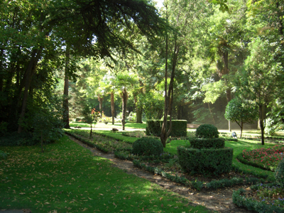
You'll love Valladolid!
The band reads "Non plus ultra", being Spains' motto in 1492, when Columbus made his discoveries.
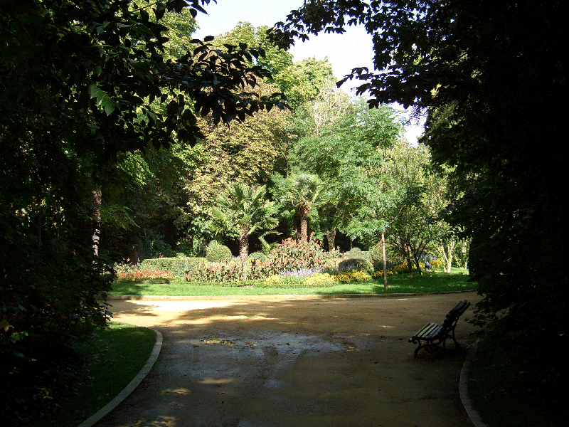
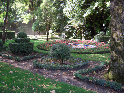
Valladolid has a nice central park.
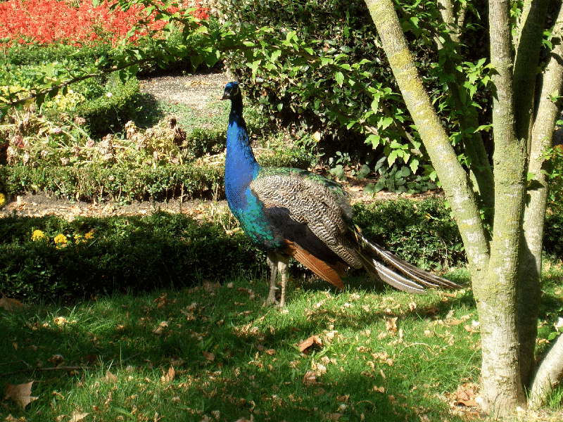
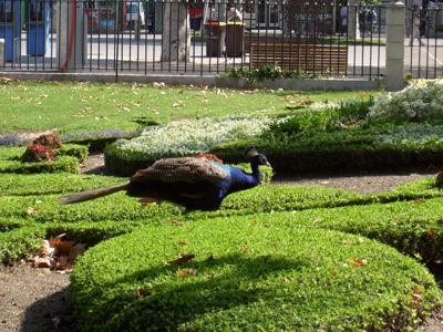
Ain't he a beauty?

Fountains
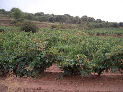
In Spain, dry as it is, people love to play with water.

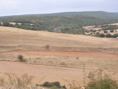
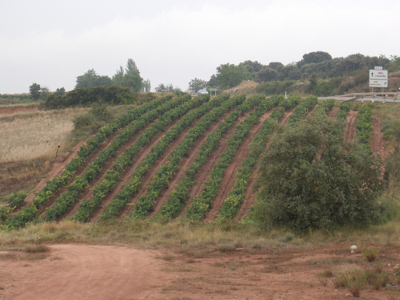
Valladolid - a city with a lot of history
Advanced usage: Custom controls
By default, the BootsFaces carousel comes complete with progress indicators (the little dots) and controls to move to the previous or next slide.
You can switch off the indicators by adding showIndicators="false". Apart from that,
BootsFaces doesn't let you modify the indicators (unless you use CSS, of course).
The controls are more flexible. You can implement your own custom controls using the tag
<b:carouselControl />. Note that the CSS class "carousel-control" add a
shadow to the left and to the right of the image, and positions the control widgets automatically.
If you don't want to use the CSS class "custom-control" - as we did in the wizard demo above -
you have to care about positioning yourself.
Also note that you need to add at least two <b:carouselControls />, one
for each direction.
Live preview
AJAX and JavaScriptsince 0.8.0
<b:carousel > supports many JavaScript and AJAX events,
as described in the description of AJAX in BootsFaces. Basically, each of the
many JavaScript callback handlers (the on[event] attributes) also supports AJAX.
Plus, it also supports the events "slideStart" when the transition to the next starts begins,
and "slid" when the transition has completed. Note that the Bootstrap standard uses "slide" instead
of "slideStart". We decided to deviate from the standard in order to improved legibility of the code.
To get familiar with BootsFaces AJAX, try the BootsFaces AJAX demo project.
Thedisabled attribute
The disabled attribute works a bit different than in most components. It disables (or rather: hides) the controls
of the carousel. It still rotates the slides (if you configure it so), but the user can't influence that. AJAX and
JavaScript events are processed no matter if the carousel is disabled or not.
Live preview
Do it yourself
If you need more flexibility than b:carousel offers,
the W3C example shows how to do it yourself.
Since v1.0.0, you don't need to load carousel CSS, since it is included in the core CSS
of default, Bootswatch and PatternFly themes.
| Attribute | Default value | Description |
|---|---|---|
| action | (none) | The button action, this can be method expression or a string outcome. |
| action-listener actionListener (alternative writing) |
(none) | A method expression that refers to a method with this signature: void methodName(Action-Event). |
| active-index activeIndex (alternative writing) |
0 | Optional attribute to define which slide is active initially. |
| ajax | false | Whether the Button submits the form with AJAX. |
| auto-update autoUpdate (alternative writing) |
false | Setting this flag updates the widget on every AJAX request. |
| col-lg colLg (alternative writing) |
-1 | Integer value to specify how many columns to span on large screens (≥1200 pixels wide). The number may optionally be followed by "column" or "columns". Alternative legal values: half, one-third, two-thirds, one-fourth, three-fourths. |
| col-md colMd (alternative writing) |
-1 | Integer value to specify how many columns to span on medium screens (≥992 pixels wide). The number may optionally be followed by "column" or "columns". Alternative legal values: half, one-third, two-thirds, one-fourth, three-fourths. |
| col-sm colSm (alternative writing) |
-1 | Integer value to specify how many columns to span on small screens (≥768p pixels wide). The number may optionally be followed by "column" or "columns". Alternative legal values: half, one-third, two-thirds, one-fourth, three-fourths. |
| col-xs colXs (alternative writing) |
-1 | Integer value to specify how many columns to span on tiny screens (≤ 767 pixels wide). The number may optionally be followed by "column" or "columns". Alternative legal values: half, one-third, two-thirds, one-fourth, three-fourths. |
| delay | (none) | Delays the AJAX request. |
| disabled | false | Boolean value to specify if the button is disabled. |
| display | block | If you use the "visible" attribute, the value of this attribute is added. Legal values: block, inline, inline-block. Default: block. |
| hidden | (none) | This column is hidden on a certain screen size and below. Legal values: lg, md, sm, xs. |
| id | (none) | Unique identifier of the component in a namingContainer. |
| interval | 5000 | Specifies the delay (in milliseconds) between each slide. |
| large-screen largeScreen (alternative writing) |
-1 | Alternative spelling to col-lg. Integer value to specify how many columns to span on large screens (≥1200 pixels wide). The number may optionally be followed by "column" or "columns". Alternative legal values: half, one-third, two-thirds, one-fourth, three-fourths. |
| medium-screen mediumScreen (alternative writing) |
-1 | Alternative spelling to col-md. Integer value to specify how many columns to span on medium screens (≥992 pixels wide). The number may optionally be followed by "column" or "columns". Alternative legal values: half, one-third, two-thirds, one-fourth, three-fourths. |
| offset | (none) | Integer value to specify how many columns to offset. |
| offset-lg offsetLg (alternative writing) |
(none) | Integer value to specify how many columns to offset. |
| offset-md offsetMd (alternative writing) |
(none) | Integer value to specify how many columns to offset. |
| offset-sm offsetSm (alternative writing) |
(none) | Integer value to specify how many columns to offset. |
| offset-xs offsetXs (alternative writing) |
(none) | Integer value to specify how many columns to offset. |
| onclick | (none) | The onclick attribute. |
| oncomplete | (none) | JavaScript to be executed when ajax completes. |
| ondblclick | (none) | Client side callback to execute when input element is double clicked. |
| onerror | (none) | JavaScript to be executed when ajax results on an error (including both network errors and Java exceptions). |
| onmousedown | (none) | Client side callback to execute when a pointer input element is pressed down over input element. |
| onmousemove | (none) | Client side callback to execute when a pointer input element is moved within input element. |
| onmouseout | (none) | Client side callback to execute when a pointer input element is moved away from input element. |
| onmouseover | (none) | Client side callback to execute when a pointer input element is moved onto input element. |
| onmouseup | (none) | Client side callback to execute when a pointer input element is released over input element. |
| onslid | (none) | Client side callback to execute when the carousel just finished sliding to another item. |
| onslidestart | (none) | Client side callback to execute when the carousel start to slide to another item. |
| onsuccess | (none) | JavaScript to be executed when ajax completes with success (i.e. there's neither a network error nor a Java exception). |
| pause | hover | Pauses the carousel from going through the next slide when the mouse pointer enters the carousel, and resumes the sliding when the mouse pointer leaves the carousel. Set pause to false to stop the ability to pause on hover. |
| process | (none) | Comma or space separated list of ids or search expressions denoting which values are to be sent to the server. |
| rendered | false | Boolean value to specify the rendering of the component, when set to false the component will not be rendered. |
| show-controls showControls (alternative writing) |
true | adds 'left' and 'right' buttons that allows the user to go back and forth between the slides manually |
| show-indicators showIndicators (alternative writing) |
true | The indicators are the little dots at the bottom of each slide (which indicates how many slides there are in the carousel, and which slide the user are currently viewing). |
| slide | true | Tells Bootstrap to show new items by sliding them into view |
| small-screen smallScreen (alternative writing) |
-1 | Alternative spelling to col-sm. Integer value to specify how many columns to span on small screens (≥768p pixels wide). The number may optionally be followed by "column" or "columns". Alternative legal values: half, one-third, two-thirds, one-fourth, three-fourths. |
| span | (none) | Integer value to specify how many columns to span on medium screens (≥992 pixels). The number may optionally be followed by "column" or "columns". Alternative legal values: half, one-third, two-thirds, one-fourth, three-fourths. |
| start-animation startAnimation (alternative writing) |
true | tells Bootstrap to begin animating the carousel immediately when the page loads. |
| style | (none) | Inline style of the input element. |
| style-class styleClass (alternative writing) |
(none) | Style class of this element. |
| tiny-screen tinyScreen (alternative writing) |
-1 | Alternative spelling to col-xs. Integer value to specify how many columns to span on tiny screens (≤ 767 pixels wide). The number may optionally be followed by "column" or "columns". Alternative legal values: half, one-third, two-thirds, one-fourth, three-fourths. |
| tooltip | (none) | The text of the tooltip. |
| tooltip-container tooltipContainer (alternative writing) |
body | Where is the tooltip div generated? That's primarily a technical value that can be used to fix rendering errors in special cases. Also see data-container in the documentation of Bootstrap. The default value is body. |
| tooltip-delay tooltipDelay (alternative writing) |
0 | The tooltip is shown and hidden with a delay. This value is the delay in milliseconds. Defaults to 0 (no delay). |
| tooltip-delay-hide tooltipDelayHide (alternative writing) |
0 | The tooltip is hidden with a delay. This value is the delay in milliseconds. Defaults to 0 (no delay). |
| tooltip-delay-show tooltipDelayShow (alternative writing) |
0 | The tooltip is shown with a delay. This value is the delay in milliseconds. Defaults to 0 (no delay). |
| tooltip-position tooltipPosition (alternative writing) |
(none) | Where is the tooltip to be displayed? Possible values: "top", "bottom", "right", "left", "auto", "auto top", "auto bottom", "auto right" and "auto left". Default to "bottom". |
| update | (none) | Component(s) to be updated with ajax. |
| visible | (none) | This column is shown on a certain screen size and above. Legal values: lg, md, sm, xs. |
| wrap | true | Specifies whether the carousel should go through all slides continuously, or stop at the last slide. |
| Attribute | Default value | Description |
|---|---|---|
| action | (none) | The button action, this can be method expression or a string outcome. |
| action-listener actionListener (alternative writing) |
(none) | A method expression that refers to a method with this signature: void methodName(Action-Event). |
| active | false | Optional attribute to define which slide is active initially. |
| ajax | false | Whether the Button submits the form with AJAX. |
| auto-update autoUpdate (alternative writing) |
false | Setting this flag updates the widget on every AJAX request. |
| caption | (none) | Optional caption, which is embedded in an h3 tag. If you need more flexibility, add an carouselCaption child tag. If you don't need a caption, omit both. |
| delay | (none) | Delays the AJAX request. |
| disabled | false | Boolean value to specify if the button is disabled. |
| id | (none) | Unique identifier of the component in a namingContainer. |
| onclick | (none) | The onclick attribute. |
| oncomplete | (none) | JavaScript to be executed when ajax completes. |
| ondblclick | (none) | Client side callback to execute when input element is double clicked. |
| onerror | (none) | JavaScript to be executed when ajax results on an error (including both network errors and Java exceptions). |
| onmousedown | (none) | Client side callback to execute when a pointer input element is pressed down over input element. |
| onmousemove | (none) | Client side callback to execute when a pointer input element is moved within input element. |
| onmouseout | (none) | Client side callback to execute when a pointer input element is moved away from input element. |
| onmouseover | (none) | Client side callback to execute when a pointer input element is moved onto input element. |
| onmouseup | (none) | Client side callback to execute when a pointer input element is released over input element. |
| onsuccess | (none) | JavaScript to be executed when ajax completes with success (i.e. there's neither a network error nor a Java exception). |
| process | (none) | Comma or space separated list of ids or search expressions denoting which values are to be sent to the server. |
| rendered | false | Boolean value to specify the rendering of the component, when set to false the component will not be rendered. |
| style | (none) | Inline style of the input element. |
| style-class styleClass (alternative writing) |
(none) | Style class of this element. |
| tooltip | (none) | The text of the tooltip. |
| tooltip-container tooltipContainer (alternative writing) |
body | Where is the tooltip div generated? That's primarily a technical value that can be used to fix rendering errors in special cases. Also see data-container in the documentation of Bootstrap. The default value is body. |
| tooltip-delay tooltipDelay (alternative writing) |
0 | The tooltip is shown and hidden with a delay. This value is the delay in milliseconds. Defaults to 0 (no delay). |
| tooltip-delay-hide tooltipDelayHide (alternative writing) |
0 | The tooltip is hidden with a delay. This value is the delay in milliseconds. Defaults to 0 (no delay). |
| tooltip-delay-show tooltipDelayShow (alternative writing) |
0 | The tooltip is shown with a delay. This value is the delay in milliseconds. Defaults to 0 (no delay). |
| tooltip-position tooltipPosition (alternative writing) |
(none) | Where is the tooltip to be displayed? Possible values: "top", "bottom", "right", "left", "auto", "auto top", "auto bottom", "auto right" and "auto left". Default to "bottom". |
| update | (none) | Component(s) to be updated with ajax. |
| Attribute | Default value | Description |
|---|---|---|
| action | (none) | The button action, this can be method expression or a string outcome. |
| action-listener actionListener (alternative writing) |
(none) | A method expression that refers to a method with this signature: void methodName(Action-Event). |
| ajax | false | Whether the Button submits the form with AJAX. |
| auto-update autoUpdate (alternative writing) |
false | Setting this flag updates the widget on every AJAX request. |
| delay | (none) | Delays the AJAX request. |
| disabled | false | Boolean value to specify if the button is disabled. |
| id | (none) | Unique identifier of the component in a namingContainer. |
| onclick | (none) | The onclick attribute. |
| oncomplete | (none) | JavaScript to be executed when ajax completes. |
| onerror | (none) | JavaScript to be executed when ajax results on an error (including both network errors and Java exceptions). |
| onmousedown | (none) | Client side callback to execute when a pointer input element is pressed down over input element. |
| onmousemove | (none) | Client side callback to execute when a pointer input element is moved within input element. |
| onmouseout | (none) | Client side callback to execute when a pointer input element is moved away from input element. |
| onmouseover | (none) | Client side callback to execute when a pointer input element is moved onto input element. |
| onmouseup | (none) | Client side callback to execute when a pointer input element is released over input element. |
| onsuccess | (none) | JavaScript to be executed when ajax completes with success (i.e. there's neither a network error nor a Java exception). |
| process | (none) | Comma or space separated list of ids or search expressions denoting which values are to be sent to the server. |
| rendered | false | Boolean value to specify the rendering of the component, when set to false the component will not be rendered. |
| style | (none) | Inline style of the input element. |
| style-class styleClass (alternative writing) |
(none) | Style class of this element. |
| tooltip | (none) | The text of the tooltip. |
| tooltip-container tooltipContainer (alternative writing) |
body | Where is the tooltip div generated? That's primarily a technical value that can be used to fix rendering errors in special cases. Also see data-container in the documentation of Bootstrap. The default value is body. |
| tooltip-delay tooltipDelay (alternative writing) |
0 | The tooltip is shown and hidden with a delay. This value is the delay in milliseconds. Defaults to 0 (no delay). |
| tooltip-delay-hide tooltipDelayHide (alternative writing) |
0 | The tooltip is hidden with a delay. This value is the delay in milliseconds. Defaults to 0 (no delay). |
| tooltip-delay-show tooltipDelayShow (alternative writing) |
0 | The tooltip is shown with a delay. This value is the delay in milliseconds. Defaults to 0 (no delay). |
| tooltip-position tooltipPosition (alternative writing) |
(none) | Where is the tooltip to be displayed? Possible values: "top", "bottom", "right", "left", "auto", "auto top", "auto bottom", "auto right" and "auto left". Default to "bottom". |
| update | (none) | Component(s) to be updated with ajax. |
| Attribute | Default value | Description |
|---|---|---|
| action | (none) | The button action, this can be method expression or a string outcome. |
| action-listener actionListener (alternative writing) |
(none) | A method expression that refers to a method with this signature: void methodName(Action-Event). |
| ajax | false | Whether the Button submits the form with AJAX. |
| auto-update autoUpdate (alternative writing) |
false | Setting this flag updates the widget on every AJAX request. |
| delay | (none) | Delays the AJAX request. |
| direction | (none) | Can take one of the values 'left' and 'right'. Determines whether the carousel scrolls to the next or to the previous image. |
| disabled | false | Boolean value to specify if the button is disabled. |
| id | (none) | Unique identifier of the component in a namingContainer. |
| onclick | (none) | The onclick attribute. |
| oncomplete | (none) | JavaScript to be executed when ajax completes. |
| ondblclick | (none) | Client side callback to execute when input element is double clicked. |
| onerror | (none) | JavaScript to be executed when ajax results on an error (including both network errors and Java exceptions). |
| onmousedown | (none) | Client side callback to execute when a pointer input element is pressed down over input element. |
| onmousemove | (none) | Client side callback to execute when a pointer input element is moved within input element. |
| onmouseout | (none) | Client side callback to execute when a pointer input element is moved away from input element. |
| onmouseover | (none) | Client side callback to execute when a pointer input element is moved onto input element. |
| onmouseup | (none) | Client side callback to execute when a pointer input element is released over input element. |
| onsuccess | (none) | JavaScript to be executed when ajax completes with success (i.e. there's neither a network error nor a Java exception). |
| process | (none) | Comma or space separated list of ids or search expressions denoting which values are to be sent to the server. |
| rendered | false | Boolean value to specify the rendering of the component, when set to false the component will not be rendered. |
| style | (none) | Inline style of the input element. |
| style-class styleClass (alternative writing) |
(none) | Style class of this element. |
| tooltip | (none) | The text of the tooltip. |
| tooltip-container tooltipContainer (alternative writing) |
body | Where is the tooltip div generated? That's primarily a technical value that can be used to fix rendering errors in special cases. Also see data-container in the documentation of Bootstrap. The default value is body. |
| tooltip-delay tooltipDelay (alternative writing) |
0 | The tooltip is shown and hidden with a delay. This value is the delay in milliseconds. Defaults to 0 (no delay). |
| tooltip-delay-hide tooltipDelayHide (alternative writing) |
0 | The tooltip is hidden with a delay. This value is the delay in milliseconds. Defaults to 0 (no delay). |
| tooltip-delay-show tooltipDelayShow (alternative writing) |
0 | The tooltip is shown with a delay. This value is the delay in milliseconds. Defaults to 0 (no delay). |
| tooltip-position tooltipPosition (alternative writing) |
(none) | Where is the tooltip to be displayed? Possible values: "top", "bottom", "right", "left", "auto", "auto top", "auto bottom", "auto right" and "auto left". Default to "bottom". |
| update | (none) | Component(s) to be updated with ajax. |