InputText
The most common form controls are text-based input fields. They accept arbitrary text (as opposed to date pickers and color pickers, which restrict the input to their data type).
The most simple example is a plain b:inputText with a placeholder attribute,
which contains an hint that is shown in the input field until something is typed in it.
The demo below shows what such a simple inputText looks like. We've added a bit of
AJAX functionality with a small delay to it to make it more interesting:
Live preview
As you noticed, the input is as large as its parent container (minus a little margin). You will see how to control its size later in this section.
Enhancing the b:inputText form control
To help you enhance the user experience, BootsFaces comes in with a useful feature:
You can easily prepend or append text to your inputTexts and what you prepend and append will seem part of the input field.
Just use the facets prepend and append and put the h:outputText element
(or image, or whatever) into the facet. You can even prepend and append at the same time, as in the following example:
Live preview
Finally, you can go further and prepend or append multiple text elements, as in the following example:
Live preview
Appending or prepending icons
You can take advantage of the <b:icon> or <b:iconAwesome> components to append (or prepend) icons :
Live preview
Appending or prepending buttons
Another nice feature is that you can append (or prepend) buttons, allowing you to build compact mini-forms for specific actions with little effort:
caveat There is only one limitation: you can not prepend or append mixed texts and buttons. The elements on each side can be only of the same type. For instance, it's possible to prepend text elements and append buttons. But it's not possible to prepend both a text element and a button at the same time.
Appending or prepending DropButtons
What you have seen also applies to DropButtons:
Live preview
Controlling the size of b:inputText
Height sizingYou can create larger or smaller form controls that match button sizes.
Use the fieldSize attribute for predefined input field sizes:
Live preview
AJAX and JavaScriptsince 0.8.0
The <b:inputText > supports the full suite of JavaScript and AJAX events,
as described in the description of AJAX in BootsFaces. Basically, each of the
many JavaScript callback handlers (the on[event] attributes) also supports AJAX.
To get familiar with BootsFaces AJAX, try the
BootsFaces AJAX demo project.
JSF 2.2 pass-through attributes
It's possible to use pass-through attributes with the <b:inputText widget, but there's a twist: the attributes are added multiple times.
This is because there are several plausible places to put a pass-through attribute in, so we decided to leave it as it is.
For instance, consider this JSF snippet:
The generated HTML code looks like so:
Labels, required fields and error messagesbreaking change in 1.1.0
You can add a label by adding the attribute label. The label is also used by the JSF messages. To give you maximum flexibility,
you can suppress automatic rendering of labels by adding renderLabel="false".
BootsFaces 1.0.2 and below:
Required inputs fields and their labels both bear the CSS class bf-required. By default, this adds an asterisk to the label.
If the field has a FacesMessage, one of the CSS classes bf-info, bf-warning,
bf-error or bf-fatal, depending on which error severity the message has.
The latter two classes color the label red.
If there's no message,
the field and its label bear the pseudo CSS class bf-no-message and has-success. The latter colors the label green by default.
BootsFaces 1.1.0:
bf-info, bf-warning,
bf-error or bf-fatal have been dropped in favor of the standard Bootstrap CSS classes has-success,
has-warning and has-error. Plus, they are applied to the form-group instead of the labels and input fields.
Compatibility settings
If your application depends on the old HTML code, activate the context parameter net.bootsfaces.legacy_error_classes
in the web.xml. The example below shows how to do this.
Live preview
Bean Validation API (JSR 303 and JSR 349)since 1.1.0
Live preview
Inline formsbreaking change in 1.1.0
To comply with the coding style recommended and supported by the Bootstrap team, we've decided to rework the concept of horizontal and inline forms from scratch in BootsFaces 1.1.0. If you're migrating from an earlier version of BootsFaces, and if you're using inline forms, you'll most likely want to replace them by horizontal forms.
Since BootsFaces 1.1.0, inline forms can only be used with a single row. There's no such thing as a multi-line
inline form. Multiline-forms are supported either by regular stacked forms (default) or by horizontal form.
You activate the horizontal form mode by using the BootsFaces form <b:form horizontal="true" >
Configuring the default value of therenderLabel attribute
Strictly speaking, BootsFaces adds a second meaning to an attribute that already exists. Standard JSF useslabel
to decorate <h:message />. In order to minimize confusion, we decided to deactivate
the label rendering feature of BootsFaces by default. However, at the end of the day, it's your application.
So it's you who needs to be in charge. Starting with BootsFaces 0.8.5, you can add a context parameter to the
web.xml of your application to set the default value of renderLabel. It goes without
saying that you can use EL expressions with this attribute. We traded performance to give you maximum flexibility.
Live preview
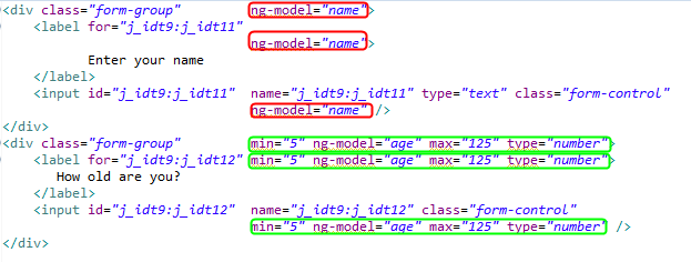
id vs. fieldId, or how to be compatible to JAAS since 0.9.0
BootsFaces adds some Bootstrap code to the HTML input field. This often leads to problems with the ids.
Intuitively, most developers expect the id of the <b:inputText> to be identical
to the id of the <h:input> field. At the same time they expect that AJAX updates the
input field when the update attribute is <b:inputText id="firstNameID" update="firstNameId" />.
To solve the problem, we've introduced a second id, the fieldId. The fieldId
is the id of the input field itself, while the attribute id refers to the entire component.
Similarly, you can optionally set the attribute name.
Note that in this case the ids of the container are not added automatically. You are responsible to make the ids and names unique.
This feature comes in handy if you're working with JAAS, which requires the id and the name of the field to be "j_username" and "j_password":
Live preview
Responsive designsince 0.9.0
You can use all the attributes controlling the responsive behaviour of <b:column />
also with <b:inputText />. Note that this is equivalent to putting it into a
<b:column />. In particular, the CSS styles are inside the column div. Responsive design only applies to horizontal forms.
Live preview
Using the span attribute for responsive design
The span attribute is a short-hand notation for col-md
or medium-screen:
Visibility depending on screen sizesince 0.8.6/0.9.0
You can play also with col-*-*, visible and hidden attribute, as any bootstrap elements. For example:
Live preview
Tagssince 0.9.0
By setting the attribute tags="true" you can display the input values as tag - similar to
<b:badge /> or to price tags in the supermarket. The tags are separated by commas. Users can
separate tags either by tying a comma or by hitting the return key.
We've dedicated a special showcase page to the input text tags.
Masksince 1.1.2improved with 1.2.1
An input mask can be set using the mask attribute.
Default masking definitions:
9: numerica: alphabetical*: alphanumericA: alphabetical, upper case&: alphanumerical upper case (note that you have to escape the & character in JSF)currency: currency (only dollars)email: email addressnumeric: numeric valuesdecimal: synonym of numericinteger: integer valuesnumeric: integer valuesh: hourss: seconds or minutes (number in the range between 0 and 59)m: simple monthy: simple yearmm/dd/yyyy: American datedd/mm/yyyy: French and Italien datedd.mm.yyyy: German date (complete list at https://github.com/RobinHerbots/Inputmask/blob/4.x/README_date.md)
Masks can also contain a variable number of tokens. For example: 9-a{1,3}9{1,3}.
This first number in the curly braces defines the minimum number of characters. The
second number specifies the maximum number of characters.
Optional masks can be defined by putting them into square brackets: 9{1,3}[,999].
When a mask starts with { it is considered to be a JSON object. This allows you to use more advanced masks,
for example using a regular expression: { regex: '\\d*' },
or set greedy to false: { mask: '9[-9999]', greedy: false }.
Read the full documentation at the project page of the
underlying JavaScript plugin
written by Robin Herbots.
Live preview
Reference section
| Attribute | Default value | Description |
|---|---|---|
| accesskey | (none) | Access key to transfer focus to the input element. |
| ajax | false | Whether the Button submits the form with AJAX. |
| alt | (none) | Alternate textual description of the input element. |
| auto-update autoUpdate (alternative writing) |
false | Setting this flag updates the widget on every AJAX request. |
| autocomplete | (none) | Controls browser autocomplete behavior. Legal values: 'off', 'false', 'true', and 'on'. |
| binding | (none) | An EL expression referring to a server side UIComponent instance in a backing bean. |
| col-lg colLg (alternative writing) |
-1 | Integer value to specify how many columns to span on large screens (≥1200 pixels wide). The number may optionally be followed by "column" or "columns". Alternative legal values: half, one-third, two-thirds, one-fourth, three-fourths. |
| col-md colMd (alternative writing) |
-1 | Integer value to specify how many columns to span on medium screens (≥992 pixels wide). The number may optionally be followed by "column" or "columns". Alternative legal values: half, one-third, two-thirds, one-fourth, three-fourths. |
| col-sm colSm (alternative writing) |
-1 | Integer value to specify how many columns to span on small screens (≥768p pixels wide). The number may optionally be followed by "column" or "columns". Alternative legal values: half, one-third, two-thirds, one-fourth, three-fourths. |
| col-xs colXs (alternative writing) |
-1 | Integer value to specify how many columns to span on tiny screens (≤ 767 pixels wide). The number may optionally be followed by "column" or "columns". Alternative legal values: half, one-third, two-thirds, one-fourth, three-fourths. |
| converter | (none) | An EL expression or a literal text that defines a converter for the component. When it's an EL expression, it's resolved to a converter instance. In case it's a static text, it must refer to a converter id. |
| converter-message converterMessage (alternative writing) |
(none) | Message to display when conversion fails. |
| delay | (none) | Delays the AJAX request. |
| dir | (none) | Direction indication for text that does not inherit directionality. Legal values: ltr (Default. Left-to-right text direction), rtl (Right-to-left text direction) and auto (let the browser figure out the direction of your alphabet, based on the page content). |
| disabled | false | Disables the input element, default is false. |
| display | block | If you use the "visible" attribute, the value of this attribute is added. Legal values: block, inline, inline-block. Default: block. |
| field-id fieldId (alternative writing) |
(none) | Unique id of the input field itself (as opposed to the id, which is belongs to the entire component, including the div surrounding the input field). Useful for frameworks like JAAS, which require you to use a specific field id. |
| field-size fieldSize (alternative writing) |
(none) | The size of the input. Possible values are xs (extra small), sm (small), md (medium) and lg (large) . |
| hidden | (none) | This column is hidden on a certain screen size and below. Legal values: lg, md, sm, xs. |
| id | (none) | Unique identifier of the component in a namingContainer. |
| immediate | false | Flag indicating that, if this component is activated by the user, notifications should be delivered to interested listeners and actions immediately (that is, during Apply Request Values phase) rather than waiting until Invoke Application phase. Default is false. |
| inline | false | Inline forms are more compact and put the label to the left hand side of the input field instead of putting it above the input field. Inline applies only to screens that are at least 768 pixels wide. |
| label | (none) | An optional label of the field. The label is only shown if you also set render-attribute='true'. The label is also used for error messages. |
| label-col-lg labelColLg (alternative writing) |
-1 | Integer value to specify how many columns to span on large screens (≥1200 pixels wide). The number may optionally be followed by "column" or "columns". Alternative legal values: half, one-third, two-thirds, one-fourth, three-fourths. |
| label-col-md labelColMd (alternative writing) |
-1 | Integer value to specify how many columns to span on medium screens (≥992 pixels wide). The number may optionally be followed by "column" or "columns". Alternative legal values: half, one-third, two-thirds, one-fourth, three-fourths. |
| label-col-sm labelColSm (alternative writing) |
-1 | Integer value to specify how many columns to span on small screens (≥768p pixels wide). The number may optionally be followed by "column" or "columns". Alternative legal values: half, one-third, two-thirds, one-fourth, three-fourths. |
| label-col-xs labelColXs (alternative writing) |
-1 | Integer value to specify how many columns to span on tiny screens (≤ 767 pixels wide). The number may optionally be followed by "column" or "columns". Alternative legal values: half, one-third, two-thirds, one-fourth, three-fourths. |
| label-large-screen labelLargeScreen (alternative writing) |
-1 | Alternative spelling to col-lg. Integer value to specify how many columns to span on large screens (≥1200 pixels wide). The number may optionally be followed by "column" or "columns". Alternative legal values: half, one-third, two-thirds, one-fourth, three-fourths. |
| label-medium-screen labelMediumScreen (alternative writing) |
-1 | Alternative spelling to col-md. Integer value to specify how many columns to span on medium screens (≥992 pixels wide). The number may optionally be followed by "column" or "columns". Alternative legal values: half, one-third, two-thirds, one-fourth, three-fourths. |
| label-small-screen labelSmallScreen (alternative writing) |
-1 | Alternative spelling to col-sm. Integer value to specify how many columns to span on small screens (≥768p pixels wide). The number may optionally be followed by "column" or "columns". Alternative legal values: half, one-third, two-thirds, one-fourth, three-fourths. |
| label-style labelStyle (alternative writing) |
(none) | The CSS inline style of the label. |
| label-style-class labelStyleClass (alternative writing) |
(none) | The CSS class of the label. |
| label-tiny-screen labelTinyScreen (alternative writing) |
-1 | Alternative spelling to col-xs. Integer value to specify how many columns to span on tiny screens (≤ 767 pixels wide). The number may optionally be followed by "column" or "columns". Alternative legal values: half, one-third, two-thirds, one-fourth, three-fourths. |
| lang | (none) | Code describing the language used in the generated markup for this component. |
| large-screen largeScreen (alternative writing) |
-1 | Alternative spelling to col-lg. Integer value to specify how many columns to span on large screens (≥1200 pixels wide). The number may optionally be followed by "column" or "columns". Alternative legal values: half, one-third, two-thirds, one-fourth, three-fourths. |
| mask | (none) | Input mask. Default masking definitions: "9": numeric, "a": alphabetical, "*": alphanumeric. |
| maxlength | 0 | The maximum length of the input. |
| medium-screen mediumScreen (alternative writing) |
-1 | Alternative spelling to col-md. Integer value to specify how many columns to span on medium screens (≥992 pixels wide). The number may optionally be followed by "column" or "columns". Alternative legal values: half, one-third, two-thirds, one-fourth, three-fourths. |
| name | (none) | The name of the field in the HMTL form and the HTTP request. Useful for frameworks like JAAS, which require you to use a specific field name. |
| offset | (none) | Integer value to specify how many columns to offset. |
| offset-lg offsetLg (alternative writing) |
(none) | Integer value to specify how many columns to offset. |
| offset-md offsetMd (alternative writing) |
(none) | Integer value to specify how many columns to offset. |
| offset-sm offsetSm (alternative writing) |
(none) | Integer value to specify how many columns to offset. |
| offset-xs offsetXs (alternative writing) |
(none) | Integer value to specify how many columns to offset. |
| onblur | (none) | Client side callback to execute when input element loses focus. |
| onchange | (none) | Client side callback to execute when input element loses focus and its value has been modified since gaining focus. |
| onclick | (none) | The onclick attribute. |
| oncomplete | (none) | JavaScript to be executed when ajax completes. |
| ondblclick | (none) | Client side callback to execute when input element is double clicked. |
| onerror | (none) | JavaScript to be executed when ajax results on an error (including both network errors and Java exceptions). |
| onfocus | (none) | Client side callback to execute when input element receives focus. |
| onkeydown | (none) | Client side callback to execute when a key is pressed down over input element. |
| onkeypress | (none) | Client side callback to execute when a key is pressed and released over input element. |
| onkeyup | (none) | Client side callback to execute when a key is released over input element. |
| onmousedown | (none) | Client side callback to execute when a pointer input element is pressed down over input element. |
| onmousemove | (none) | Client side callback to execute when a pointer input element is moved within input element. |
| onmouseout | (none) | Client side callback to execute when a pointer input element is moved away from input element. |
| onmouseover | (none) | Client side callback to execute when a pointer input element is moved onto input element. |
| onmouseup | (none) | Client side callback to execute when a pointer input element is released over input element. |
| onselect | (none) | Client side callback to execute when text within input element is selected by user. |
| onsuccess | (none) | JavaScript to be executed when ajax completes with success (i.e. there's neither a network error nor a Java exception). |
| placeholder | (none) | The placeholder attribute shows text in a field until the field is focused upon, then hides the text. |
| process | (none) | Comma or space separated list of ids or search expressions denoting which values are to be sent to the server. |
| readonly | false | Flag indicating that this input element will prevent changes by the user. |
| render-label renderLabel (alternative writing) |
net.bootsfaces.component.ComponentUtils.isRenderLabelDefault() | Allows you to suppress automatic rendering of labels. Used internally by AngularFaces, too. |
| rendered | false | Boolean value to specify the rendering of the component, when set to false the component will not be rendered. |
| required | false | Boolean value Require input in the component when the form is submitted. |
| required-message requiredMessage (alternative writing) |
(none) | Message to show if the user did not specify a value and the attribute required is set to true. |
| size | 0 | Number of characters used to determine the width of the input element. |
| small-screen smallScreen (alternative writing) |
-1 | Alternative spelling to col-sm. Integer value to specify how many columns to span on small screens (≥768p pixels wide). The number may optionally be followed by "column" or "columns". Alternative legal values: half, one-third, two-thirds, one-fourth, three-fourths. |
| span | (none) | Integer value to specify how many columns to span on medium screens (≥992 pixels). The number may optionally be followed by "column" or "columns". Alternative legal values: half, one-third, two-thirds, one-fourth, three-fourths. |
| style | (none) | Inline style of the input element. |
| style-class styleClass (alternative writing) |
(none) | Style class of this element. |
| tabindex | (none) | Position of this element in the tabbing order for the current document. This value must be an integer between 0 and 32767. |
| tags | false | Show the words of the input text as tags (similar to price tags in the supermarket). You can select one or more tags. The list is sent to the backend bean as a comma-separated list. |
| tiny-screen tinyScreen (alternative writing) |
-1 | Alternative spelling to col-xs. Integer value to specify how many columns to span on tiny screens (≤ 767 pixels wide). The number may optionally be followed by "column" or "columns". Alternative legal values: half, one-third, two-thirds, one-fourth, three-fourths. |
| title | (none) | Advisory tooltip information. |
| tooltip | (none) | The text of the tooltip. |
| tooltip-container tooltipContainer (alternative writing) |
body | Where is the tooltip div generated? That's primarily a technical value that can be used to fix rendering errors in special cases. Also see data-container in the documentation of Bootstrap. The default value is body. |
| tooltip-delay tooltipDelay (alternative writing) |
0 | The tooltip is shown and hidden with a delay. This value is the delay in milliseconds. Defaults to 0 (no delay). |
| tooltip-delay-hide tooltipDelayHide (alternative writing) |
0 | The tooltip is hidden with a delay. This value is the delay in milliseconds. Defaults to 0 (no delay). |
| tooltip-delay-show tooltipDelayShow (alternative writing) |
0 | The tooltip is shown with a delay. This value is the delay in milliseconds. Defaults to 0 (no delay). |
| tooltip-position tooltipPosition (alternative writing) |
(none) | Where is the tooltip to be displayed? Possible values: "top", "bottom", "right", "left", "auto", "auto top", "auto bottom", "auto right" and "auto left". Default to "bottom". |
| type | (none) | Type of the input. The default is text. |
| typeahead | false | Activates the type-ahead aka autocomplete function. The list of values has to be defined in typeahead-values. |
| typeahead-highlight typeaheadHighlight (alternative writing) |
true | Highlights the part of the suggestions that has already been entered. Defaults to true. |
| typeahead-hint typeaheadHint (alternative writing) |
true | If set to false, the typeahead will not show a hint. Defaults to true. |
| typeahead-limit typeaheadLimit (alternative writing) |
5 | Maximum number of suggestions to be shown. Defaults to 5. |
| typeahead-minLength typeaheadMinLength (alternative writing) |
1 | Minimum number of characters to be entered before a suggestion is shown. |
| typeahead-values typeaheadValues (alternative writing) |
(none) | Comma-separated list of values that can be used for the typeahead list. |
| update | (none) | Component(s) to be updated with ajax. |
| validator | (none) | A method expression referring to a method validationg the input. |
| validator-message validatorMessage (alternative writing) |
(none) | Message to display when validation fails. |
| value | (none) | Value. |
| value-change-listener valueChangeListener (alternative writing) |
(none) | A method binding expression referring to a method for handling a valuechangeevent. |
| visible | (none) | This column is shown on a certain screen size and above. Legal values: lg, md, sm, xs. |
-
<b:inputfield />is aninputtag bearing the CSS-classform-control. -
If the attribute
requiredis true, the pseudo CSS classbf-requiredis added. Thus you can define your custom style for required fields. -
If there's a
FacesMessage, the input field is bears one of the pseudo CSS classesbf-info,bf-warning,bf-errororbf-fatal. If there are no messages, the input field bears the pseudo CSS classbf-no-messageandhas-success. The latter colors the label green by default. - If there's a label, it bears the CSS class
required, if it's a mandatory field. This class adds an asterisk to the label text. You can override the CSS class to remove the asterisk or to replace it by something else. - If there's a label, it bears the CSS classes
bf-info,bf-warning,bf-errororbf-fatal, depending on which severity the error message the input field has. The latter two classes color the label red.
If there's no message, the label bears the pseudo CSS classbf-no-messageandhas-success. The latter colors the label green by default.